
Hero Repository — mobile responsive version /* ========================================================================== [A] DÉJÀ PRÉSENT SUR LA PAGE — ne pas recoller si tu réinjectes dans Referentiel-Utilisateurs. Conservé ici pour l'aperçu autonome. ========================================================================== */ :root{ --bg:#080b18; --bg-top:#0d1430; --line:rgba(255,255,255,.08); --line-2:rgba(255,255,255,.14); --text:#eef1fb; --text-2:#aeb6d2; --text-3:#757e9e; --accent:#F5842C; --accent-soft:rgba(245,132,44,.14); --accent-line:rgba(245,132,44,.42); --font:'Plus Jakarta Sans',-apple-system,BlinkMacSystemFont,'Segoe UI',sans-serif; --display:'Plus Jakarta Sans','Geist',sans-serif; --maxw:1200px; } *{ box-sizing:border-box; } body{ margin:0; font-family:var(--font); background:var(--bg); color:var(--text); font-size:16px; line-height:1.6; overflow-x:hidden; -webkit-font-smoothing:antialiased; } body::before{ content:""; position:fixed; inset:0; z-index:-2; background: radial-gradient(900px 600px at 12% -8%, rgba(99,112,240,.20), transparent 60%), radial-gradient(800px 600px at 92% 4%, rgba(245,132,44,.10), transparent 55%), radial-gradient(1000px 800px at 50% 120%, rgba(80,70,229,.14), transparent 60%), linear-gradient(180deg, var(--bg-top), var(--bg) 38%); } body::after{ content:""; position:fixed; inset:0; z-index:-1; background-image: linear-gradient(to right, rgba(255,255,255,.035) 1px, transparent 1px), linear-gradient(to bottom, rgba(255,255,255,.035) 1px, transparent 1px); background-size:64px 64px; -webkit-mask-image:radial-gradient(circle at 50% 30%, #000 0%, transparent 78%); mask-image:radial-gradient(circle at 50% 30%, #000 0%, transparent 78%); } a{ color:inherit; text-decoration:none; } img{ max-width:100%; display:block; } .wrap{ width:100%; max-width:var(--maxw); margin:0 auto; padding:0 28px; } .btn{ display:inline-flex; align-items:center; justify-content:center; gap:9px; font-weight:600; font-size:15.5px; letter-spacing:-.01em; padding:14px 24px; border-radius:999px; border:1px solid transparent; white-space:nowrap; transition:transform .14s ease, box-shadow .18s ease, background .18s ease, border-color .18s ease, color .18s; } .btn svg{ width:18px; height:18px; } .btn-primary{ background:#fff; color:#0b1020; box-shadow:0 1px 0 rgba(255,255,255,.6) inset, 0 10px 30px -10px rgba(255,255,255,.35); } .btn-primary:hover{ transform:translateY(-2px); box-shadow:0 16px 40px -12px rgba(255,255,255,.45); } .btn-ghost{ background:rgba(255,255,255,.02); color:#fff; border-color:var(--line-2); } .btn-ghost:hover{ border-color:rgba(255,255,255,.4); background:rgba(255,255,255,.06); transform:translateY(-2px); } .btn-lg{ padding:17px 30px; font-size:16.5px; } .arrow{ transition:transform .16s ease; } .btn:hover .arrow{ transform:translateX(3px); } .btn:focus-visible{ outline:2px solid #8f86ff; outline-offset:3px; } .reveal{ opacity:0; transform:translateY(26px); } .reveal.in{ opacity:1; transform:none; transition:opacity .7s cubic-bezier(.2,.7,.2,1), transform .7s cubic-bezier(.2,.7,.2,1); } @media (prefers-reduced-motion:reduce){ .reveal{ opacity:1; transform:none; } } /* ========================================================================== [B] SECTION HERO — typographie fluide (clamp) au lieu de tailles fixes. C'est ce qui évite le titre sur 8 lignes en mobile. ========================================================================== */ .mnt-hero{ padding:32px 0 44px; position:relative; } .mnt-hero-split{ display:grid; grid-template-columns:1.08fr .92fr; gap:48px; align-items:center; } .mnt-hero-copy{ order:2; } .mnt-shot{ order:1; } .mnt-hero-copy{ position:relative; z-index:6; } .mnt-hero-copy .h1{ font-family:var(--display); font-weight:700; font-size:clamp(27px, 5.6vw, 38px); letter-spacing:-.03em; line-height:1.06; color:#fff; margin-top:22px; margin-bottom:0; text-wrap:balance; } .mnt-hero-copy .grad-text{ background:linear-gradient(100deg,#f5a623,#f25563 55%,#9b7cf6); -webkit-background-clip:text; background-clip:text; color:transparent; } .mnt-hero-copy .h-lede{ color:var(--text-2); line-height:1.55; font-size:clamp(14.5px, 1.6vw, 15.5px); margin:15px 0 0; } .modtag{ display:inline-flex; align-items:center; gap:8px; padding:6px 13px 6px 9px; border-radius:999px; font-size:clamp(11px, 1.3vw, 12.5px); font-weight:600; line-height:1.3; color:var(--tagc,var(--accent)); background:color-mix(in srgb,var(--tagc,var(--accent)) 14%,transparent); border:1px solid color-mix(in srgb,var(--tagc,var(--accent)) 40%,transparent); } .modtag .mi{ width:21px; height:21px; border-radius:7px; display:grid; place-items:center; flex:none; background:var(--tagc,var(--accent)); color:#fff; } .modtag .mi svg{ width:13px; height:13px; } .hero-flist{ list-style:none; padding:0; margin:22px 0 0; display:grid; gap:10px; } .hero-flist li{ display:flex; gap:10px; align-items:flex-start; font-size:clamp(13.5px, 1.5vw, 14px); line-height:1.45; color:var(--text-2); } .hero-flist .ck{ flex:none; width:19px; height:19px; border-radius:50%; display:grid; place-items:center; margin-top:2px; background:color-mix(in srgb,var(--accent) 16%,transparent); color:var(--accent); } .hero-flist .ck svg{ width:11px; height:11px; } .mnt-hero-copy .cta-row{ display:flex; gap:12px; flex-wrap:wrap; margin-top:26px; } /* ========================================================================== [C] VISUEL DU HERO Cadre visuel repris de .appwin : même rayon, même liseré, même halo. ========================================================================== */ .mnt-shot{ position:relative; margin:0; border-radius:16px; overflow:hidden; background:#F4F6FA; /* fond clair = raccord invisible */ border:1px solid rgba(255,255,255,.12); box-shadow:0 40px 90px -30px rgba(0,0,0,.85), 0 0 0 1px rgba(255,255,255,.05), 0 0 80px -30px rgba(99,112,240,.5); isolation:isolate; line-height:0; } .mnt-shot img{ width:100%; height:auto; display:block; } /* ========================================================================== [D] RESPONSIVE ========================================================================== */ /* Tablette et mobile : une seule colonne + on libère le hero des paddings Divi. Le :has() cible automatiquement section / row / colonne / module parents, aucune classe à ajouter dans le Divi Builder. */ @media (max-width:980px){ .mnt-hero-split{ grid-template-columns:1fr; gap:28px; } .et_pb_section:has(.mnt-hero), .et_pb_row:has(.mnt-hero), .et_pb_column:has(.mnt-hero), .et_pb_module:has(.mnt-hero){ padding-left:0 !important; padding-right:0 !important; margin-left:0 !important; margin-right:0 !important; width:100% !important; max-width:100% !important; } } /* Mobile */ @media (max-width:720px){ .wrap{ padding:0 16px; } /* la seule marge restante */ .mnt-hero{ padding:14px 0 36px; } .mnt-hero-copy .h1{ margin-top:16px; font-size:clamp(28px, 7.4vw, 38px); } .mnt-hero-copy .h-lede{ font-size:15px; } .hero-flist{ margin-top:18px; gap:11px; } /* CTA empilés, pleine largeur */ .mnt-hero-copy .cta-row{ display:grid; grid-template-columns:1fr; gap:10px; margin-top:22px; } .mnt-hero-copy .cta-row .btn{ width:100%; } .btn-lg{ padding:15px 22px; font-size:15.5px; } /* image masquée : le mockup est illisible sous 720px */ .mnt-shot{ display:none; } .mnt-hero-split{ gap:0; } /* pas de vide laissé par le grid */ } /* Petits écrans (iPhone SE / mini) */ @media (max-width:420px){ .wrap{ padding:0 14px; } } /* Le widget de chat flotte en bas à droite : on lui laisse de la place */ @media (max-width:720px) and (pointer:coarse){ .mnt-hero{ padding-bottom:64px; } } <!-- Symboles SVG : ic-layers / ic-check / ic-arrow existent déjà dans les {{{wpml_tag_15}}} de la page. To paste back only for standalone use. --> <!-- ========================================================================== HERO — to replace existing {{{wpml_tag_30}}} block ========================================================================== -->
Sites, equipment & users

Centralize your sites, equipment, and users on a single platform.

Bring together all information about your assets, service providers, and employees in a single repository. Provide your teams with reliable, always up-to-date data, and simplify day-to-day operations management.

  • A single repository for sites, equipment, service providers, and employees
  • Technical, administrative, and financial data always up to date
  • Access rights tailored to each person’s role
  • QR Code automatically generated for each site
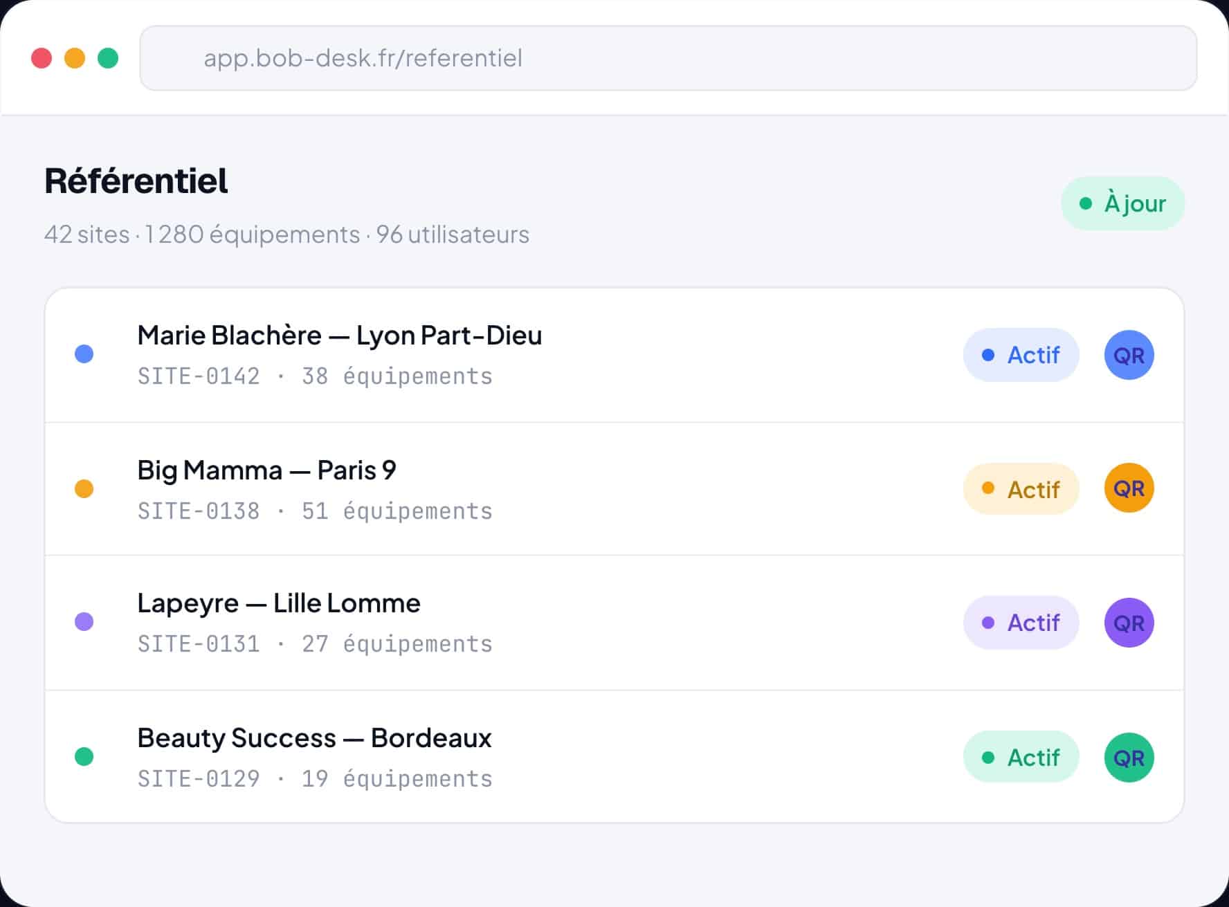
<!-- Le {{{wpml_tag_90}}} mobile renvoie un GIF 1x1 : sous 720px l'image est masquée en CSS, this {{{wpml_tag_91}}} also avoids downloading the desktop JPG for no reason. --> srcset="data:image/gif;base64,R0lGODlhAQABAIAAAAAAAP///yH5BAEAAAAALAAAAAABAAEAAAIBRAA7"> alt="The Bob! Desk repository: 42 sites, 1,280 pieces of equipment and 96 centralized users" fetchpriority="high" decoding="async">

THEY CENTRALIZE THEIR ASSETS WITH BOB! DESK

Lapeyre
Big Mamma
Castorama
HEMA
Fusalp
Groupe SOS
Lapeyre
Big Mamma
Castorama
HEMA
Fusalp
Groupe SOS
The repository

Manage your repository from A to Z.

From your equipment to your employees, Bob! Desk centralizes all essential information in a single repository. Your teams always work with the right data, regardless of the number of sites.

/* ========================================================================== CARTE FEATURE — .bd-feat-card Desktop : 2 colonnes, image alignée en haut sur le badge Mobile : 1 colonne, texte quasi bord à bord, image APRÈS le texte ========================================================================== */ .bd-feat-card{ display:grid; grid-template-columns:minmax(0,1fr) minmax(0,1.1fr); gap:48px; align-items:start; /* le haut de l'image = le haut du badge */ } .bd-feat-card > *{ min-width:0; } /* colonne image (ciblée par son contenu : marche que l'image soit à gauche ou à droite) */ .bd-feat-card > *:has(img){ padding:0; margin:0; line-height:0; overflow:hidden; border-radius:12px; /* le radius est sur le conteneur */ } .bd-feat-card > *:has(img) img{ width:100%; height:auto; display:block; border-radius:0; } /* ========================================================================== MOBILE ========================================================================== */ @media (max-width:900px){ /* 1. On libère la carte des paddings Divi : c'est eux qui créent la grande marge */ .et_pb_row:has(.bd-feat-card), .et_pb_column:has(.bd-feat-card), .et_pb_module:has(.bd-feat-card){ padding-left:0 !important; padding-right:0 !important; margin-left:0 !important; margin-right:0 !important; width:100% !important; max-width:100% !important; } /* 2. Une seule colonne, 16px de marge de confort pour le texte */ .bd-feat-card{ display:flex; flex-direction:column; gap:26px; padding:0 16px; } .bd-feat-card > *{ order:1; /* texte en premier */ width:100%; flex:none; } /* 3. L'image passe en dernier et sort des 16px : pleine largeur d'écran */ .bd-feat-card > *:has(img){ order:2; margin-inline:-16px; border-radius:0; } .bd-feat-card > *:has(img) img{ width:100% !important; height:auto !important; display:block !important; } /* 4. Typographie resserrée */ .bd-feat-title{ font-size:clamp(24px, 6.6vw, 32px); line-height:1.14; } .bd-feat-sub{ font-size:15px; line-height:1.55; } .bd-feat-list li{ font-size:14.5px; line-height:1.45; } }
Sites & equipment

Centralize all information about your assets.

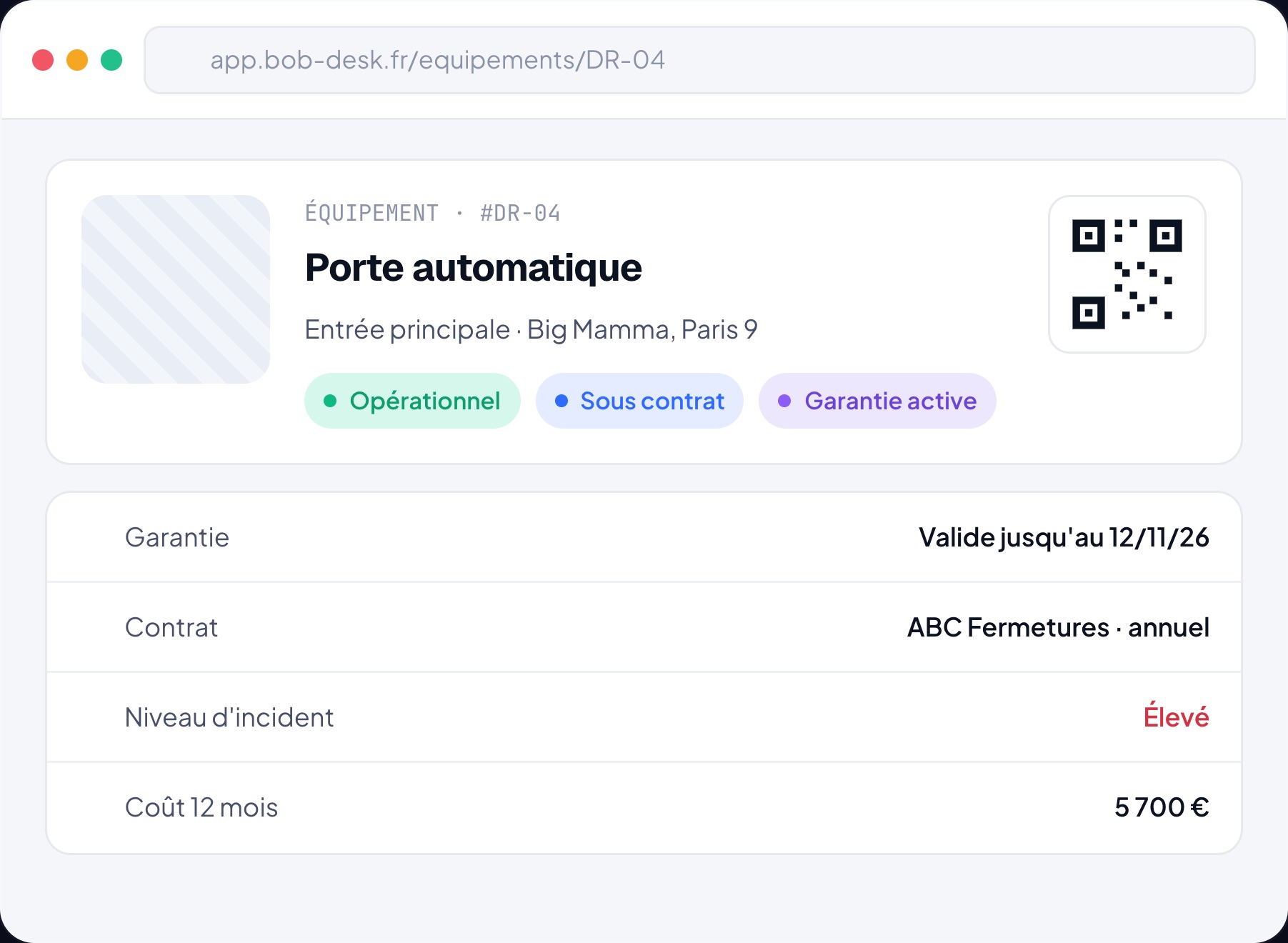
Find all technical, administrative, and financial data for your sites and equipment in just a few clicks.

  • Fully customizable equipment records
  • Photos, documents, warranties, and contracts
  • Expense tracking and performance indicators
  • Management of insurance, warranties, and leases
  • QR Code automatically generated for each site
  • Change history and complete asset tree
alt="Bob! Desk interface - Equipment">
/* ========================================================================== CARTE FEATURE — .bd-feat-card Desktop : 2 colonnes, image alignée en haut sur le badge Mobile : 1 colonne, texte quasi bord à bord, image APRÈS le texte (CSS commun à toutes les cartes — à ne coller qu'une fois si tu le mets dans Divi → Options du thème → CSS personnalisé) ========================================================================== */ .bd-feat-card{ display:grid; grid-template-columns:minmax(0,1fr) minmax(0,1.1fr); gap:48px; align-items:start; /* le haut de l'image = le haut du badge */ } .bd-feat-card > *{ min-width:0; } /* carte inversée : l'image est la 1re colonne, c'est elle qui prend le plus de place */ .bd-feat-card.bd-feat-reverse{ grid-template-columns:minmax(0,1.1fr) minmax(0,1fr); } /* colonne image, repérée par son contenu : marche à gauche comme à droite */ .bd-feat-card > *:has(img){ padding:0; margin:0; line-height:0; overflow:hidden; border-radius:12px; /* le radius est sur le conteneur */ } .bd-feat-card > *:has(img) img{ width:100%; height:auto; display:block; border-radius:0; } /* ========================================================================== MOBILE ========================================================================== */ @media (max-width:900px){ /* 1. On libère la carte des paddings Divi : c'est eux qui créent la grande marge */ .et_pb_row:has(.bd-feat-card), .et_pb_column:has(.bd-feat-card), .et_pb_module:has(.bd-feat-card){ padding-left:0 !important; padding-right:0 !important; margin-left:0 !important; margin-right:0 !important; width:100% !important; max-width:100% !important; } /* 2. Une seule colonne, 16px de marge de confort pour le texte */ .bd-feat-card, .bd-feat-card.bd-feat-reverse{ display:flex; flex-direction:column; gap:26px; padding:0 16px; } .bd-feat-card > *{ order:1; /* texte en premier */ width:100%; flex:none; } /* 3. L'image passe en dernier et sort des 16px : pleine largeur d'écran */ .bd-feat-card > *:has(img){ order:2; margin-inline:-16px; border-radius:0; } .bd-feat-card > *:has(img) img{ width:100% !important; height:auto !important; display:block !important; } /* 4. Typographie resserrée */ .bd-feat-title{ font-size:clamp(24px, 6.6vw, 32px); line-height:1.14; } .bd-feat-sub{ font-size:15px; line-height:1.55; } .bd-feat-list li{ font-size:14.5px; line-height:1.45; } }
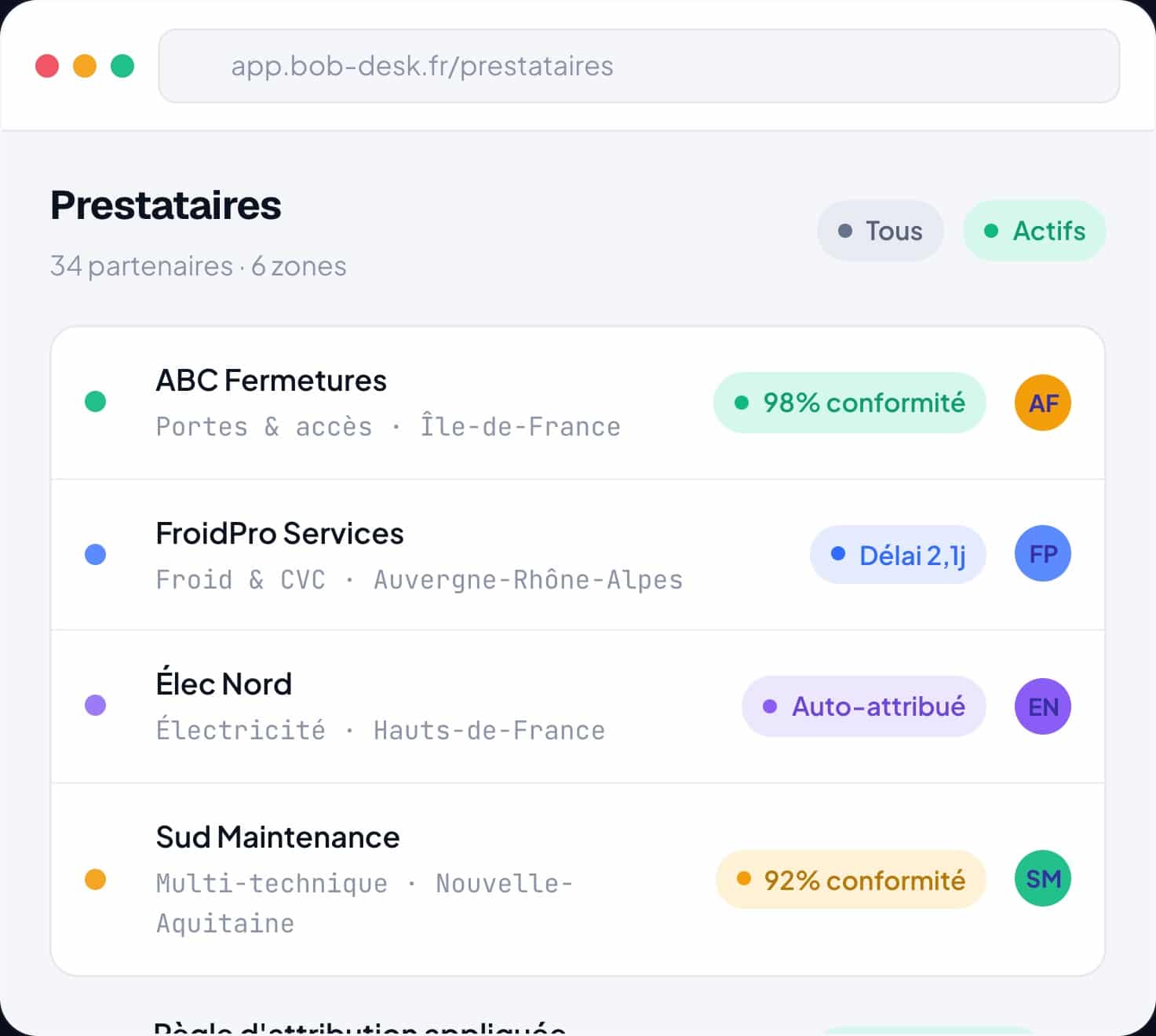
alt="Bob! Desk interface - Service providers">
Providers

Manage your service provider network efficiently.

Structure your partner network, automate intervention assignment, and measure their performance.

  • Assignment by geographic area or skill
  • Automatic assignment rules
  • Performance tracking by service provider
  • Dedicated access to the platform
  • Simple interface, no training required
Teams & users

Give everyone the right access.

Easily configure user profiles and adjust access rights according to each person’s responsibilities.

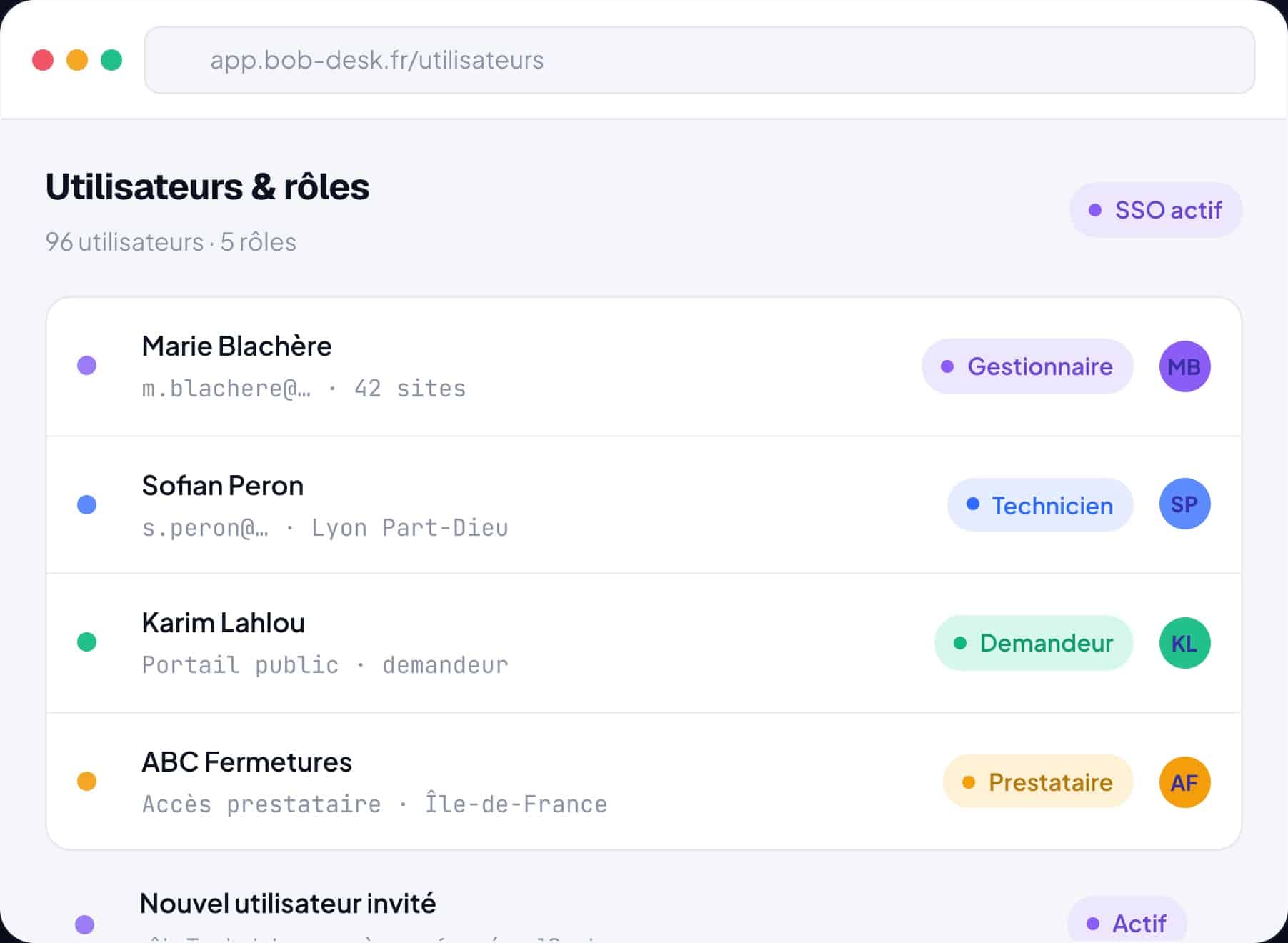
  • Quick user creation
  • Role and permission management
  • Custom notifications
  • Public portal for request creation
  • SSO authentication
Bob! Desk interface - Users & Roles
KEY FIGURES

Reliable data, teams operational faster.

/* ========================================================================== GRILLE RÉSULTATS — .bd-results-grid Desktop : 3 colonnes Mobile : 2 colonnes quasi bord à bord, cartes compactes ========================================================================== */ .bd-results-grid{ display:grid; grid-template-columns:repeat(3,minmax(0,1fr)); gap:24px; } /* -------------------------------------------------------------------------- MOBILE -------------------------------------------------------------------------- */ @media (max-width:900px){ /* 1. On libère la grille des paddings Divi (la grande marge vient de là) */ .et_pb_row:has(.bd-results-grid), .et_pb_column:has(.bd-results-grid), .et_pb_module:has(.bd-results-grid){ padding-left:0 !important; padding-right:0 !important; margin-left:0 !important; margin-right:0 !important; width:100% !important; max-width:100% !important; } /* 2. Deux colonnes, gouttière serrée, 10px de marge extérieure */ .bd-results-grid{ grid-template-columns:repeat(2,minmax(0,1fr)); gap:10px; padding:0 10px; } /* 3. Cartes compactes : c'est le padding et la typo qui les rendent carrées */ .bd-result-card{ padding:16px 14px !important; border-radius:14px; } .bd-result-number{ font-size:clamp(26px, 8vw, 34px) !important; line-height:1.05; letter-spacing:-.02em; } /* l'unité ("intervention de moins", "min", "rôles") reste discrète */ .bd-result-number .bd-unit-white{ font-size:.52em; } .bd-result-label{ font-size:10px !important; letter-spacing:.06em; line-height:1.3; margin:8px 0 0 !important; } .bd-result-desc{ font-size:12.5px !important; line-height:1.4; margin:8px 0 0 !important; } } /* Très petits écrans : on garde 2 colonnes, on resserre encore */ @media (max-width:400px){ .bd-results-grid{ gap:8px; padding:0 8px; } .bd-result-card{ padding:14px 12px !important; } .bd-result-desc{ font-size:12px !important; } }
1 fewer intervention

PER SITE & PER YEAR

At least one intervention avoided per site per year on equipment thanks to an up-to-date repository.

10 min

USER ONBOARDING

To create a new user and assign the right access based on their role.

100%

CENTRALIZED DATA

Sites, equipment, service providers, and employees brought together in a single repository.

-70%

SCATTERED FILES

Fewer spreadsheets and emails: no more data scattered across teams.

5 roles

TAILORED ACCESS

Manager, technician, requester, service provider, reader: everyone sees what concerns them.

1 QR / site

INSTANT ON-SITE ACCESS

A QR Code automatically generated to report and retrieve information on site.

/* ========================================================================== RANGÉE DE CTA — .bd-cta-row ========================================================================== */ .bd-cta-row{ display:flex; justify-content:center; flex-wrap:wrap; gap:14px; } .bd-cta-row a.et_pb_button{ font-size:clamp(15px, 4.1vw, 20px) !important; padding:16px 32px !important; white-space:nowrap !important; /* jamais de retour à la ligne */ text-align:center; line-height:1.2 !important; } @media (max-width:600px){ .bd-cta-row{ flex-direction:column; align-items:stretch; gap:10px; padding:0 14px; } .bd-cta-row a.et_pb_button{ padding:15px 20px !important; /* moins de padding = plus de place au texte */ width:100%; } }
TO GO FURTHER

The foundation of high-performing maintenance.

A reliable repository is the foundation of high-performing maintenance. Bob! Desk helps you standardize your data, facilitate collaboration, and ensure every team works with the right information.

Centralized data

All information about your sites, equipment, and employees is brought together in a single platform.

Simplified collaboration

Each user accesses only the information they need, with a permission level tailored to their role.

More reliable decisions

Manage your operations with up-to-date data, accurate indicators, and a complete history of your assets.

Included in all our offers.

The fundamentals you need for a smooth deployment, included in your subscription.

Automatic updates

The platform continuously evolves, without any intervention on your part.

Human support, 9 AM–6 PM

A responsive team that replies within a few hours, at no extra cost.

Open API & SSO

Secure connection to your directory and business tools.

/* ========================================================================== TÉMOIGNAGES — MOBILE : 1 carte à la fois, swipe + flèches Le scroll-jacking desktop est neutralisé sous 900px. (Ce bloc complète ta feuille de style existante, il ne la remplace pas.) ========================================================================== */ @media (max-width:900px){ /* 1. On coupe le scroll-jacking */ .bd-test-pin{ height:auto !important; } .bd-test-sticky{ position:static !important; top:auto !important; } .bd-test-track{ transform:none !important; } /* 2. On libère le bloc des paddings Divi */ .et_pb_row:has(.bd-test-pin), .et_pb_column:has(.bd-test-pin), .et_pb_module:has(.bd-test-pin){ padding-left:0 !important; padding-right:0 !important; margin-left:0 !important; margin-right:0 !important; width:100% !important; max-width:100% !important; } .bd-test-header{ padding:0 14px; } .bd-test-hint{ display:none !important; } /* remplacé par les flèches */ /* 3. Défilement horizontal natif, une carte par écran */ .bd-test-shell{ position:relative; } /* wrapper injecté par le JS */ .bd-test-viewport{ overflow-x:auto !important; overflow-y:hidden; padding:0 14px 6px; scroll-snap-type:x mandatory; scroll-behavior:smooth; -webkit-overflow-scrolling:touch; scrollbar-width:none; } .bd-test-viewport::-webkit-scrollbar{ display:none; } .bd-test-track{ display:flex !important; flex-wrap:nowrap !important; gap:12px; } .bd-test-card{ flex:0 0 100% !important; width:100% !important; max-width:none !important; min-width:0; scroll-snap-align:center; } /* 4. Flèches de navigation — les deux exactement au même niveau */ .bd-test-nav{ position:absolute; top:50%; transform:translateY(-50%); z-index:6; width:38px; height:38px; display:grid; place-items:center; padding:0; border:1px solid rgba(255,255,255,.24); border-radius:50%; background:rgba(10,14,28,.74); backdrop-filter:blur(8px); color:#fff; cursor:pointer; transition:opacity .18s ease, background .18s ease; } .bd-test-nav svg{ width:17px; height:17px; } .bd-test-nav:active{ background:rgba(30,38,64,.9); } .bd-test-nav[hidden]{ display:none; } .bd-test-nav-prev{ left:4px; } .bd-test-nav-next{ right:4px; } .bd-test-nav:focus-visible{ outline:2px solid #8f86ff; outline-offset:2px; } } /* Desktop : aucune flèche, comportement d'origine */ @media (min-width:901px){ .bd-test-nav{ display:none !important; } }
THEY TESTIFY

They regained control.

Scroll
2:12
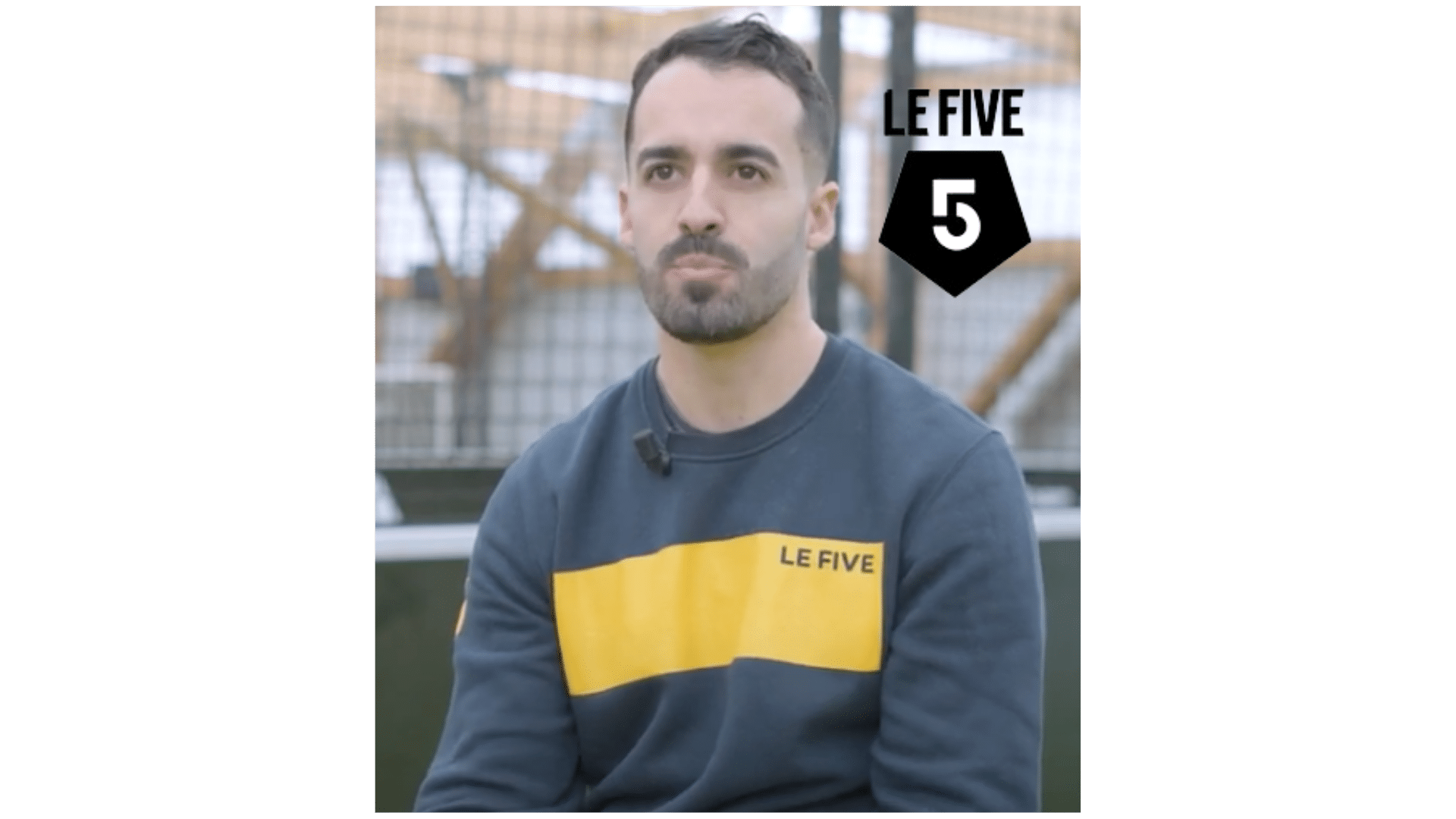
Leisure Le Five

“Bob! Desk perfectly meets the needs of Le Five. A simple, intuitive CMMS software, and above all a reactive team very close to us, which allows direct exchanges with members of the Bob! Desk team.”
1:36
Retail Lapeyre

“Since Bob! Desk, Lapeyre has been able to optimize the management of its internal processes, ensuring increased consistency between teams and a rise in efficiency. Its deployment allowed us to centralize requests, reduce silos and improve operational responsiveness on a daily basis.”
1:38
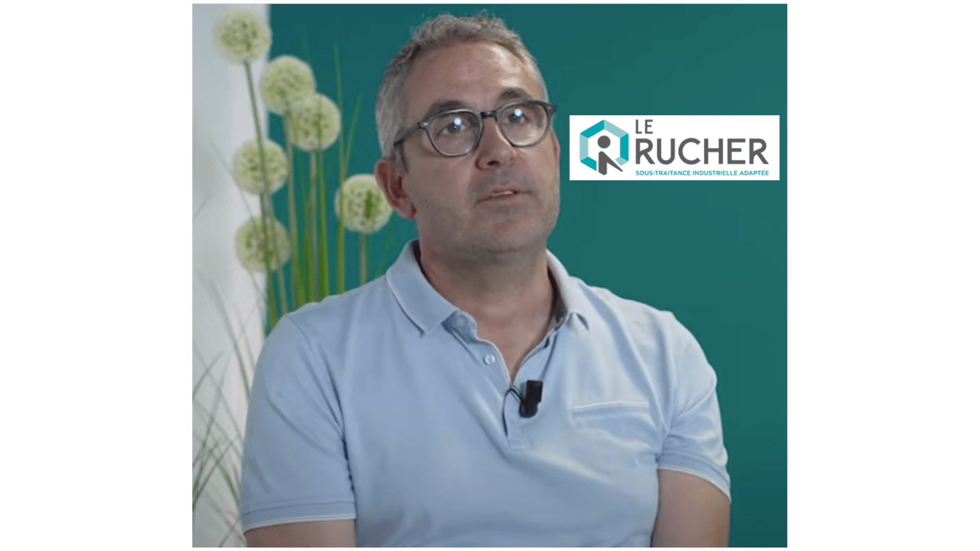
Association Le Rucher

“Bob! Desk meets our criteria for tickets and preventive maintenance. With Bob! Desk, we can work on multiple devices: PC, smartphone, and tablet, and even via the CMMS application.”
1:50
Retail Beauty Success

“A great maintenance tracking software! We appreciate the flexibility of the tool and the fact that the team is dynamic and attentive. We abandoned our Excel files and lightened our inboxes. I love the supplier invoice validation module.”

1:28
Service Provider Tourne & Vis

“We were actively looking for an intervention management software for our technicians. Since the implementation of the CMMS software, a real change has occurred in how we collaborate. It's now more efficient, simpler, and everything is done with full transparency.”

2:14
Medical-Social Age&Vie

“Thanks to Bob! Desk, Age&Vie has been able to structure and effectively track all of its internal requests, guaranteeing better responsiveness and better transparency between departments. It allows us to centralize exchanges and fluidify processes within our homes.”

Restaurant Marie Blachère

“Since we have been using Bob! Desk to manage our network of bakeries (+1000), our maintenance team has gained fluidity. The interface is intuitive, and customer support is always reactive and available. A solution I recommend without hesitation.”

Restaurant Big Mamma

“A simple and powerful CMMS solution with excellent ergonomics. It is the tool that allows us to optimize our maintenance and communicate effectively with the restaurants. The Bob! Desk team is attentive and reactive. I recommend!”

(function () { var pin = document.getElementById('bd-test-pin'); var sticky = document.getElementById('bd-test-sticky'); var track = document.getElementById('bd-test-track'); if (!pin || !sticky || !track) return; var viewport = track.parentElement; /* .bd-test-viewport */ var STICKY_OFFSET = 120; /* = le "top" du CSS sticky */ var MOBILE = window.matchMedia('(max-width:900px)'); var maxTranslate = 0; /* wrapper pour positionner les flèches (neutre sur desktop) */ var shell = document.createElement('div'); shell.className = 'bd-test-shell'; viewport.parentNode.insertBefore(shell, viewport); shell.appendChild(viewport); /* ---------------- flèches ---------------- */ var SVG_OPEN = ''; var ARROW_LEFT = SVG_OPEN + ''; var ARROW_RIGHT = SVG_OPEN + ''; function makeBtn(dir, label, svg) { var b = document.createElement('button'); b.type = 'button'; b.className = 'bd-test-nav bd-test-nav-' + dir; b.setAttribute('aria-label', label); b.innerHTML = svg; b.addEventListener('click', function () { go(dir === 'prev' ? -1 : 1); }); shell.appendChild(b); return b; } var prevBtn = makeBtn('prev', 'Témoignage précédent', ARROW_LEFT); var nextBtn = makeBtn('next', 'Témoignage suivant', ARROW_RIGHT); function step() { var card = track.firstElementChild; var gap = parseFloat(getComputedStyle(track).columnGap) || 12; return card ? card.getBoundingClientRect().width + gap : viewport.clientWidth; } function go(dir) { viewport.scrollBy({ left: dir * step(), behavior: 'smooth' }); } function updateArrows() { if (!MOBILE.matches) return; var max = viewport.scrollWidth - viewport.clientWidth; prevBtn.hidden = viewport.scrollLeft = max - 8; } viewport.addEventListener('scroll', updateArrows, { passive: true }); /* ---------------- scroll-jacking desktop ---------------- */ function recalc() { if (MOBILE.matches) { pin.style.height = ''; return; } maxTranslate = Math.max(0, track.scrollWidth - viewport.clientWidth); pin.style.height = (sticky.offsetHeight + maxTranslate * 1.15) + 'px'; } function onScroll() { if (MOBILE.matches) { track.style.transform = ''; return; } var rect = pin.getBoundingClientRect(); var scrollable = pin.offsetHeight - sticky.offsetHeight; if (scrollable <= 0) { track.style.transform = 'translateX(0px)'; return; }var progress = (STICKY_OFFSET - rect.top) / scrollable;progress = Math.max(0, Math.min(1, progress));track.style.transform = 'translateX(' + (-progress * maxTranslate) + 'px)';}function applyMode() {if (MOBILE.matches) {pin.style.height = '';track.style.transform = '';updateArrows();} else {viewport.scrollLeft = 0;recalc();onScroll();}}if (MOBILE.addEventListener) MOBILE.addEventListener('change', applyMode);else MOBILE.addListener(applyMode);window.addEventListener('load', applyMode);window.addEventListener('resize', applyMode);window.addEventListener('scroll', onScroll, { passive: true });setTimeout(applyMode, 300);/* ---------------- lecture YouTube ---------------- */track.querySelectorAll('.bd-test-thumb[data-youtube-id]').forEach(function (thumb) {var playBtn = thumb.querySelector('.bd-test-play');if (!playBtn) return;playBtn.addEventListener('click', function () {var iframe = document.createElement('iframe');iframe.src = 'https://www.youtube-nocookie.com/embed/' + thumb.getAttribute('data-youtube-id') + '?autoplay=1&rel=0';iframe.setAttribute('frameborder', '0');iframe.setAttribute('allow', 'accelerometer; autoplay; clipboard-write; encrypted-media; gyroscope; picture-in-picture');iframe.setAttribute('allowfullscreen', '');iframe.style.cssText = 'width:100%;height:100%;position:absolute;top:0;left:0;border:none;';thumb.innerHTML = '';thumb.style.backgroundImage = 'none';thumb.appendChild(iframe);setTimeout(applyMode, 100);});});})();
FREQUENTLY ASKED QUESTIONS

Everything you need to know about the repository.

An equipment repository is a centralized database that brings together all of a company’s assets: buildings, sites, equipment, documents, warranties, contracts, and maintenance histories. It enables teams to rely on accurate, up-to-date information to manage their maintenance operations effectively.

Centralizing equipment data saves time, improves traceability, and reduces errors. By bringing equipment records, technical documents, warranties, contracts, and intervention history together in a single platform, teams can quickly access the information they need to make the right decisions.

Bob! Desk lets you create a complete record for each site and each piece of equipment. You can link photos, technical documents, warranties, insurance, leases, expenses, performance indicators, as well as a complete history of interventions. Each asset also has a QR Code for instant access to its information on site.

Yes. Bob! Desk centralizes all your service providers in a single repository. You can define their intervention areas, areas of expertise, set up automatic assignment rules, and track their performance. Service providers also have dedicated access to the platform to facilitate communication and intervention tracking.

Bob! Desk makes it easy to create accounts for your employees and define their roles, permissions, and intervention scopes. Each user accesses only the information and features that match their responsibilities, ensuring secure data management.

CMMS software centralizes all data related to equipment, sites, users, and service providers in a single platform. With Bob! Desk, companies improve data quality, facilitate collaboration between teams, and gain a complete view of their assets to manage maintenance operations more effectively.

(function() { var list = document.getElementById('bd-faq2-list'); if (!list) return; var items = list.querySelectorAll('.bd-faq2-item'); items.forEach(function(item) { var btn = item.querySelector('.bd-faq2-question'); var answer = item.querySelector('.bd-faq2-answer'); btn.addEventListener('click', function() { var isOpen = item.classList.contains('bd-faq2-open'); items.forEach(function(other) { other.classList.remove('bd-faq2-open'); other.querySelector('.bd-faq2-answer').style.maxHeight = null; other.querySelector('.bd-faq2-toggle').textContent = '+'; }); if (!isOpen) { item.classList.add('bd-faq2-open'); answer.style.maxHeight = (answer.scrollHeight + 30) + 'px'; item.querySelector('.bd-faq2-toggle').textContent = '×'; } }); }); })();
REQUEST A DEMONSTRATION

Build a solid foundation for all your operations.

Discover how Bob! Desk helps multi-site companies centralize their data, simplify user management, and improve the reliability of their operations.

  • Personalized demo for your sector
  • Supported import of your assets
  • Response from an expert in less than 1 business hour
This site is registered on wpml.org as a development site. Switch to a production site key to remove this banner.